1. Styling HTML5 elements with CSS3 properties
All style sheets can be added in three ways:
• You can use the <style> tag to define the properties of elements in the HTML5 page.
• You can use external style sheets, which are text files where you store a style you may want to reuse.
Most professional developers and designers prefer
the CSS3 external style sheets because perfecting the desired style
takes a lot of work. When you want to make a change to the design of a
Web site, you can make changes to many pages that use an external style
sheet, just by changing the one style sheet. It’s just more efficient
than having to change the <style> attributes in each individual Web page.
You also can add styles without style sheets by using inline styles. An
inline style is like a “Break Glass in Case of Emergency!” technique. A
good-looking page has a plan developed in a style sheet. However,
sometimes, you run into a case where you need some feature added, and
instead of changing the style sheet, you just pop it in with a tag.
Embedded style sheets
An embedded style sheet is simply adding the style sheet directly into the HTML5 script. In the <head> of the program, add the style sheet using the <style>
container. Place the element you want to style in the style container,
and then add values to the property to be styled. Figure 1 shows the
general format.
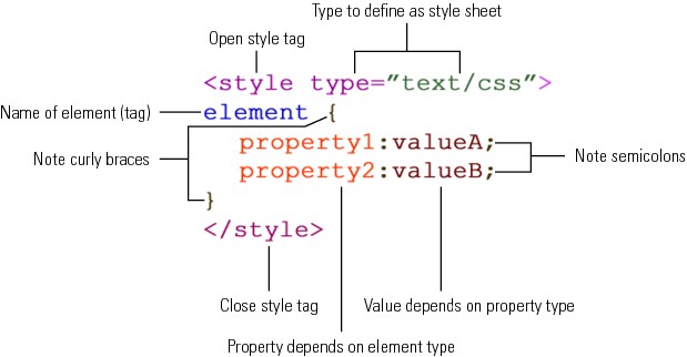
Figure 1: An embedded style sheet.
Each element has a unique set of properties, and
each property has values that can be assigned to it. When you change the
value of the property, that value appears in the text inside the
element’s container. So, if you change the text color to red, all the
text inside the element’s container will be red.
<!DOCTYPE HTML>
<html>
<head>
<meta http-equiv=”Content-Type” content=”text/html; charset=UTF-8”>
<style type=”text/css”>
body {
background-color:#fbf7e4;
font-family:Verdana, Geneva, sans-serif;
margin-left:20px;
color:#8e001c;
}
h1 {
background-color:#8E001C;
color:#e7e8d1;
font-family:”Arial Black”, Gadget, sans-serif;
text-align:center;
}
h2 {
background-color:#424242;
color:#d3ceaa;
font-family:”Trebuchet MS”, Arial, Helvetica, sans-serif;
margin-left:5px;
}
</style>
<title>CSS3-Embedded Stylesheet</title>
</head>
<body>
<h1>This Is the Big Head</h1>
<h2> Here Is the Second Head</h2>
The body text is styled for a bit of a eft margin and picks up the color of the body along with its font. Notice that the background of the heads extends all the way across the page. Also notice that a space (& nbsp;)
gives the h2 text a ittle indent so that it stays “within” the
background. That’s not a problem with the h1 head because it’s centered.
</body>
</html>
Figure 2 shows how the styled page looks.
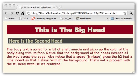
Figure 2: Text styled with CSS3.
You should be aware that when you use style sheets,
you have to pay attention to the little details — like adding both curly
braces, separating the property from the values by colons, and ending
each property value with a semicolon. If your CSS3 style sheet doesn’t
work as you think it should, check those little gotchas!
When using background colors, the background often extends across the entire page. Certain inline elements such as <span>
can be used to contain the background to the affected text. With
background colors in headers that are left- or right-justified, you’ll
want to add a space ( ) so that it doesn’t bleed into the background color of the page.
External style sheets
With all the different kinds of style combinations
you may have to consider — including different formats for desktops,
laptops, and small mobile screens — the work involved in creating a good
style sheet or set of style sheets can be considerable. By saving your
CSS3 work to a text file, you can reuse your style sheet as often as you
want. Plus, you can copy your embedded CSS and easily paste it into a
text file and save it as a .css file.
For example, let’s take a color scheme with a set of
colors that a corporate client, Mighty Smite Web Development, has
described as the corporate palette. (That means you can use only the set
of colors provided.) You start with the following company colors:
#3C371E, #8C5F26, #BCA55F, #F2CC6E, #F26205
The background color must be #F2CC6E.
You don’t have to know what the color is — you just have to know that
the company has decided that it’s going to be the background color.
You’re told that the designers can figure out the rest.
Further, you’re told that they’d like a version that
looks good on a phone and a different one that looks good on a desktop.
So, that means you’re going to need two different CSS3 style sheets.
Later on, you’ll worry about how the browser is going to know whether
the user is viewing from a desktop with a screen the size of a drive-in
theater or viewing from a Droid phone.
All that’s required is the following tag:
<link rel=”stylesheet” type=”text/css” href=”mightySmiteSmall.css” />
This tag goes in the <head> container where the <style> tag had gone along with the CSS3 code. Now the CSS3 code goes into a separate file. Notice that the <link> tag contains an href attribute assigned the value mightySmiteSmall.css.
To create a CSS3 file, all you have to do is enter the CSS3 code in a text editor or Web development application minus the <style> tags. The following shows the example to be used here:
@charset “UTF-8”;
/* CSS Document */
/*3C371E,8C5F26,BCA55F,F2CC6E,F26205 */
body
{
background-color:#F2CC6E;
font-family:”Lucida Sans Unicode”, “Lucida Grande”, sans-serif;
color:#8C5F26;
font-size:11px;
max-width:480px;
}
h1
{
color:#BCA55F;
background-color:#3C371E;
font-family:”Arial Black”, Gadget, sans-serif;
text-align:center;
}
h2
{
color:#F26205;
font-family:”Lucida Sans Unicode”, “Lucida Grande”, sans-serif
}
h3
{
color:#3C371E;
font-family:Tahoma, Geneva, sans-serif;
}
The top line lets the browser know that it’s a UTF-8
character set, and the second two lines are comment lines. They’re
different from the comment lines in HTML5, but they work the same. The
second comment line is a handy way to keep track of the color palette
and can save time in setting up the style sheet.
To test this mobile version of the CSS3 code, the following HTML5 file is used:
<!DOCTYPE HTML>
<html>
<head>
<link rel=”stylesheet” type=”text/css” href=”mightySmiteSmall.css” />
<meta http-equiv=”Content-Type” content=”text/html; charset=UTF-8”>
<title>Mighty Smite Sofware Test Sheet</title>
</head>
<body>
<h1>Mighty Smite Software Conglomorate</h1>
<h2>This is an h2 head</h2>
<h3>Here’s an h3 head</h3>
Lorem ipsum dolor sit amet, consectetur
adipisicing elit, sed do eiusmod tempor incididunt ut abore et dolore
magna aliqua. Ut enim ad minim veniam, quis nostrud exercitation ullamco
aboris nisi ut aliquip ex ea commodo consequat. Duis aute irure dolor
in reprehenderit in voluptate velit esse cillum dolore eu fugiat nulla
pariatur. Excepteur sint occaecat cupidatat non proident, sunt in culpa
qui officia deserunt mollit anim id est aborum.
</body>
</html>
All the styles in the CSS3 file are used to test
their appearance, and the body text beginning with Lorem ipsum is filler
text, used to get an idea of what a text block looks like. (It’s been
used since the 16th century, so it must be good.)
In setting up the CSS3 file, the only setting that specifically targeted mobile devices is the width setting in the body
element. It’s set to 480px because that’s the width of the iPhone used
in testing. However, depending on how users hold their mobile devices,
they’ll get different results. Figures 3 and 4 show what the page
looks like when the phone is held at different angles.
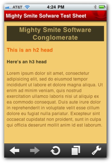
Figure 3: Style set for mobile device vertical.
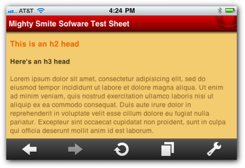
Figure 4: Style set for mobile device horizontal.
A unique feature of many mobile devices is that they
allow Web pages to be viewed from different aspects — vertical or
horizontal. So, when I’m preparing a CSS3 file for a mobile device, I
tend to set the width to the horizontal. However, you’ll quickly find
that different mobile browsers work differently. At the time of this
writing, the Apple Safari browser on the iPhone displayed the page in a
tiny, unreadable page that had to be expanded, but the Opera Mini
browser (as shown in Figures 3-9 and 3-10) on the same iPhone using the
same size screen displayed the page immediately in an optimum viewing
size, whether viewed horizontally or vertically.
Inline style
A third way to add CSS3 to your document is to simply add a style attribute to an element that redefines the content in the element’s container.
<!DOCTYPE HTML>
<html>
<head>
<meta http-equiv=”Content-Type” content=”text/html; charset=UTF-8”>
<title>Inline CSS3</title>
</head>
<body>
<div style=”font-family:Verdana, Geneva, sans-serif;font-size:24px;background-color:yellow;color:navy;”>This is important!</div>
<p>But this...not so much</p>
<p style=”font-size:10px;font-family:sans-serif;”>And this you can ignore altogether....
</body>
</html>
Figure 5 shows what you see when you test the Web
page in a browser. Keep in mind that the second line has no styling at
all added.
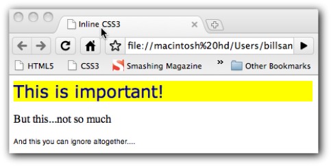
Figure 5: Inline CSS3.
The use of inline CSS3 can be invaluable when some
feature of your CSS3 external file doesn’t have a style for something on
your Web page that needs to be there. Generally, inline is one of those
tools you want to use both sparingly and judiciously. This is
especially true when dealing with other developers and designers who are
working from a common style sheet.